top of page


LUNESSANT
Lunessant is a French boulangerie that celebrates heaven in every bite.
client
Lunessant (Mexico, 2025)
work
Branding / Packaging
ask
Lunessant is a French bakery whose name comes from a play of the words "Lune" (which means "moon" in French)" and "Croissant" (which means "crescent" in French), also "Lunessant" (which means "Holy Monday" in French) it alludes to the heavenly nature of each bite. The client was looking for a visual identity that reflected this poetic connection, with an elegant and modern style. The request was for a predominantly white aesthetic with subtle color accents.
solution
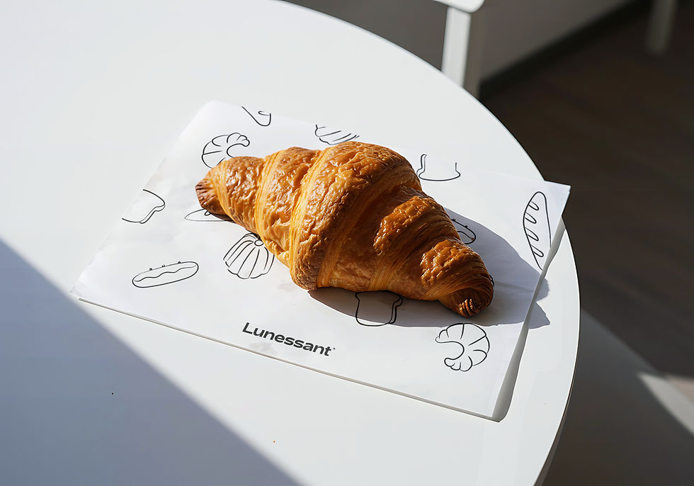
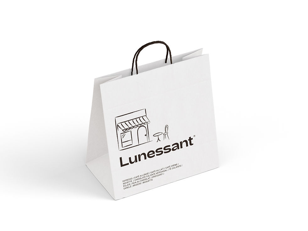
Graphic elements inspired by various French breads were used, as well as the main illustration, which merges the shapes of a crescent moon and a croissant into the visual identity. The logo features distinctive yet simple typography.
The color palette is composed of white and intense black with hints of orange to accentuate the design. The visual system balances sobriety and warmth, ideal for packaging, signage, and digital content, conveying an identity with subtle nods to French bakery and its connection to the celestial.
year
25


Collab
Branding/
Alejandra Jáuregui
Alejandro Villalobos
Packaging/
Alejandra Jáuregui
Alejandro Villalobos
bottom of page